Code
corr_table| Variable | Correlation with Life Expectancy | |
|---|---|---|
| 0 | Schooling | 0.732484 |
| 5 | Polio | 0.641217 |
| 1 | GDP per capita | 0.583090 |
| 6 | Hepatitis B | 0.417804 |
| 4 | Infant Deaths | -0.920032 |
| 3 | Under 5 Deaths | -0.920419 |
| 2 | Adult Mortality | -0.945360 |
This project looks at which factors are most closely associated with life expectancy across countries from 2000 to 2015. The notebook focuses on schooling, GDP per capita, mortality, immunization, region-level averages, and a few comparison checks between developed and developing countries.
The dataset covers 193 countries from 2000 to 2015. The two economy-status columns were combined into a single “Developed” or “Developing” label to keep comparisons easy to read.
The table below shows how strongly each factor moves together with life expectancy. Values close to 1 mean they tend to rise together; values close to -1 mean one goes up as the other goes down.
corr_table| Variable | Correlation with Life Expectancy | |
|---|---|---|
| 0 | Schooling | 0.732484 |
| 5 | Polio | 0.641217 |
| 1 | GDP per capita | 0.583090 |
| 6 | Hepatitis B | 0.417804 |
| 4 | Infant Deaths | -0.920032 |
| 3 | Under 5 Deaths | -0.920419 |
| 2 | Adult Mortality | -0.945360 |
Education level (Schooling) has the strongest positive relationship with life expectancy, while adult mortality and child deaths have the strongest negative ones.
The notebook first checked whether schooling and GDP move together.
fig_school_gdp = px.scatter(
    df,
    x="Schooling",
    y="GDP per capita",
    color="Region",
    opacity=0.6,
    hover_data=["Country"],
    title="Schooling vs GDP per Capita"
)
fig_school_gdp.show()
The notebook’s result here is straightforward: countries with more schooling tend to have higher GDP per capita. That does not prove schooling alone causes GDP to rise, but it does show a clear positive association.
GDP is positively related to life expectancy, but the notebook shows that this is only part of the story.
fig_curr = px.scatter(
    df,
    x="GDP per capita",
    y="Life Expectancy",
    title="Life Expectancy vs GDP Per Capita",
    opacity=0.6,
    color="Region",
    hover_data=["Country"]
)
fig_curr.show()fig_mort = px.scatter(
df,
x="Adult Mortality",
y="Life Expectancy",
title="Adult Mortality vs Life Expectancy",
opacity=0.5,
color="Region"
)
fig_mort.show()Countries with higher adult mortality and more child deaths tend to have lower life expectancy. Of all the factors in the dataset, these two have the strongest inverse relationship with how long people live.
The notebook also compared public health conditions by region.
fig_vax = px.bar(
    regional_vaccines,
    x="Region",
    y="Average Coverage",
    color="Vaccination",
    barmode="group",
    title="Average Vaccination Coverage by Region"
)
fig_vax.update_layout(xaxis_title="Region", yaxis_title="Average Coverage (%)")
fig_vax.show()fig_health = px.bar(
regional_health.melt(id_vars="Region", var_name="Measure", value_name="Average"),
x="Region",
y="Average",
color="Measure",
barmode="group",
title="Regional Child Health And Wealth Summary"
)
fig_health.update_layout(xaxis_title="Region", yaxis_title="Average Value")
fig_health.show()These plots reflect the notebook’s regional story: wealthier regions generally have lower child mortality and higher vaccination coverage, while lower-income regions face larger health burdens.
The notebook also compared developed and developing countries directly.
fig_status = px.bar(
    status_summary,
    x="Status",
    y="Life Expectancy",
    title="Average Life Expectancy by Economic Status",
    color="Status"
)
fig_status.update_layout(xaxis_title="Status", yaxis_title="Average Life Expectancy")
fig_status.show()
That comparison supports a key finding. Developed countries tend to have higher average life expectancy, but the gap is better explained by a combination of schooling, mortality, vaccination, and income rather than any single factor.
The notebook also compared three developed countries, Spain, France, and Japan, against three developing countries, India, Guyana, and Kenya. The pattern is clear across teenage thinness, adult mortality, and life expectancy. Developed countries show longer lifespans and lower mortality, while the developing countries in this comparison face more undernourished adolescents and higher death rates, especially India.
The notebook also checked whether large populations were automatically linked to worse health outcomes.
fig_pop_hiv = px.scatter(
    df,
    x="Population (million)",
    y="HIV",
    color="Status",
    opacity=0.6,
    hover_data=["Country"],
    title="Population vs HIV"
)
fig_pop_hiv.show()fig_pop_mort = px.scatter(
df,
x="Population (million)",
y="Adult Mortality",
color="Status",
opacity=0.6,
hover_data=["Country"],
title="Population vs Adult Mortality"
)
fig_pop_mort.show()These plots support the notebook’s point that population size by itself does not explain HIV or adult mortality very well. Development level gives a better picture.
The notebook also asked whether more schooling was linked to faster improvement in life expectancy from 2000 to 2015.
def improvement_rate(group):
    group = group.sort_values("Year")
    if len(group) >= 16 and group["Life Expectancy"].iloc[0] > 0:
        start = group["Life Expectancy"].iloc[0]
        end = group["Life Expectancy"].iloc[-1]
        return (end - start) / start * 100
    return np.nan

developing = df[df["Status"] == "Developing"].copy()
developing_rates = developing.groupby("Country").apply(improvement_rate).reset_index(name="Improvement Rate")
developing_2000 = developing[developing["Year"] == 2000][["Country", "Schooling"]].merge(developing_rates, on="Country", how="left")

world_rates = df.groupby("Country").apply(improvement_rate).reset_index(name="Improvement Rate World")
world_2000 = df[df["Year"] == 2000][["Country", "Schooling"]].merge(world_rates, on="Country", how="left")

schooling_growth = pd.DataFrame({
    "Scope": ["Developing countries", "World"],
    "Correlation with Schooling": [
        developing_2000["Schooling"].corr(developing_2000["Improvement Rate"]),
        world_2000["Schooling"].corr(world_2000["Improvement Rate World"]),
    ]
})
schooling_growth
/var/folders/m8/n9sdgg714q730gpdhvdt8g3w0000gn/T/ipykernel_33370/1858055924.py:10: FutureWarning:
DataFrameGroupBy.apply operated on the grouping columns. This behavior is deprecated, and in a future version of pandas the grouping columns will be excluded from the operation. Either pass `include_groups=False` to exclude the groupings or explicitly select the grouping columns after groupby to silence this warning.
/var/folders/m8/n9sdgg714q730gpdhvdt8g3w0000gn/T/ipykernel_33370/1858055924.py:13: FutureWarning:
DataFrameGroupBy.apply operated on the grouping columns. This behavior is deprecated, and in a future version of pandas the grouping columns will be excluded from the operation. Either pass `include_groups=False` to exclude the groupings or explicitly select the grouping columns after groupby to silence this warning.
| Scope | Correlation with Schooling | |
|---|---|---|
| 0 | Developing countries | -0.469977 |
| 1 | World | -0.510111 |
Countries with more schooling tended to improve their life expectancy faster over the 15-year period, both among developing countries and globally. This reinforces education as one of the most consistent factors in the analysis.
The analysis points to three consistent patterns:
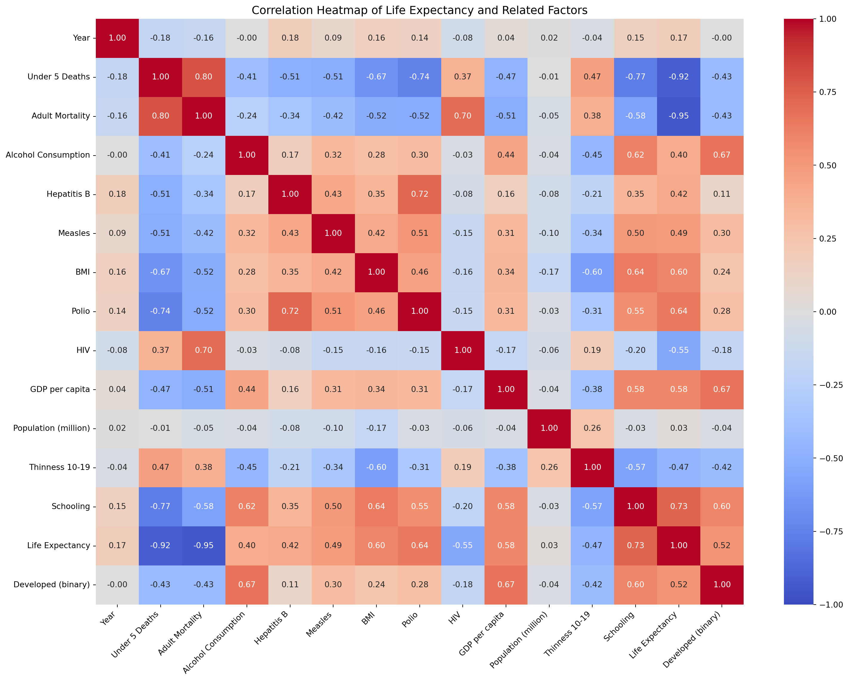
Use the scatter plot below to explore how GDP per capita and life expectancy relate across different countries and years. Hover over any point to see the country name. The heatmap further down shows the full picture. It compares every numerical variable in the dataset with every other one. Deep red means a strong positive relationship, and deep blue means a strong negative one.
fig = px.scatter(
    df,
    x="GDP per capita",
    y="Life Expectancy",
    hover_data=["Country", "Year"],
    color="Status",
    opacity=0.6,
    title="Life Expectancy vs GDP per Capita"
)

fig.show()df_heat = df.drop(columns=["Economy Status - Developing", "Infant Deaths"]).rename(columns={
"Alcohol Consum": "Alcohol Consumption",
"Thin 10-19": "Thinness 10-19",
"Economy Status - Developed": "Developed (binary)",
})
numeric_df = df_heat.select_dtypes(include=np.number)
corr_matrix = numeric_df.corr()
fig, ax = plt.subplots(figsize=(16, 12))
sns.heatmap(
corr_matrix,
annot=True,
fmt=".2f",
cmap="coolwarm",
center=0,
vmin=-1,
vmax=1,
ax=ax
)
ax.set_title("Correlation Heatmap of Life Expectancy and Related Factors", fontsize=14)
plt.xticks(rotation=45, ha="right")
plt.yticks(rotation=0)
plt.tight_layout()
plt.show()